Data Is Beautiful
- Large Graph Visualization Tools and Approaches | by Sviatoslav Kovalev
> What to do, if you need to visualize a large network graph but all tools you try can only draw a hairball or eat all your RAM and hang…
Just wanted to share this article that I came across (tho it's from 2019).
- Twenty-nine research teams analyzed the same data, and they all reached different results.
https://fivethirtyeight.com/features/science-isnt-broken/
---
Another study with the same goal of comparing the results from different research teams found similar disparities, though the graphs aren't quite as pretty.
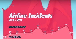
- Airline Incidents: How Do Boeing and Airbus Compare?www.visualcapitalist.com Airline Incidents: How Do Boeing and Airbus Compare?
This graphic shows U.S. airline incidents across the two largest aircraft manufacturers in the world as Boeing faces increased scrutiny.
- ProPublica's Nonprofit Explorer: shows highest earning non-profits per state, as well as highest-paid non-profit executives.projects.propublica.org Nonprofit Explorer - ProPublica
Since 2013, the IRS has released data culled from millions of nonprofit tax filings. Use this database to find organizations and see details like their executive compensation, revenue and expenses, as well as download tax filings going back as far as 2001.

- How much it costs to cut 1 metric ton of carbon emission with various methods for different global carbon emission levels
As you reduce the amount of carbon emissions (the y axis) the methods to keep reducing carbon cost more (the x axis.)
This great graph came to my attention from this video from vlogbrothers. It also has some good explanations of what it means.
Note that carbon capture doesn't really make sense till you've exhausted all the other emission minimizing methods.
Source: https://www.edf.org/revamped-cost-curve-reaching-net-zero-emissions
- results are now live - 2023 Instance Census for lemmy.ca
At the end of 2023, we ran a census on lemmy.ca. Analyzing the data took a little longer than I thought it would, but the results are now available!
To see the post, you can do one of:
- Use this link: https://lemmy.ca/post/15125231
- On mobile, your app should open it in your home instance
- On desktop, you can use the InstanceAssistant extension to redirect the post
- Open !main@lemmy.ca and see the pinned posts
I didn't do a regular crosspost in case there is an error in the results. This way I only need to fix one post instead of many.
Hope you enjoy :)
- Use this link: https://lemmy.ca/post/15125231
- Euler diagram of the terminology of the British Isles
Apologies. This might not be the perfect community for the post.
- Distribution of more than 64,000 Z-values from PLOS ONE. Despite being a journal that welcomes null results, there's a huge hole of non-significant studies.
Created by Adrian Barnett: https://twitter.com/aidybarnett/status/1572006426167619585
- Total energy production sources and consumption by state
Total energy production sources and consumption by state https://www.eia.gov/beta/states/overview @dataisbeautiful
- What's the value of statistical life (VSL)?
What's the value of statistical life (VSL)?
@dataisbeautiful LabPlot ❤️ Data
➡️ https://en.wikipedia.org/wiki/Value\_of\_life
\#DataAnalysis #DataScience #Data #DataViz #Visualization #Plotting #Statistics #Life #Risk #Safety #Security \#USA #USDA #FOSS #OpenSource #FLOSS #VSL
- Using Zipf's Law to detect outliers in median age of European Countries in #LabPlot (2023 est.)
Using Zipf's Law to detect outliers in median age of European Countries in #LabPlot (2023 est.)
LabPlot ❤️ Data
➡️ https://en.wikipedia.org/wiki/Zipf%27s\_law
\#DataAnalysis #DataScience #Data #DataViz #Visualization #Plotting #Statistics #Age #Europe #FOSS #OpenSource
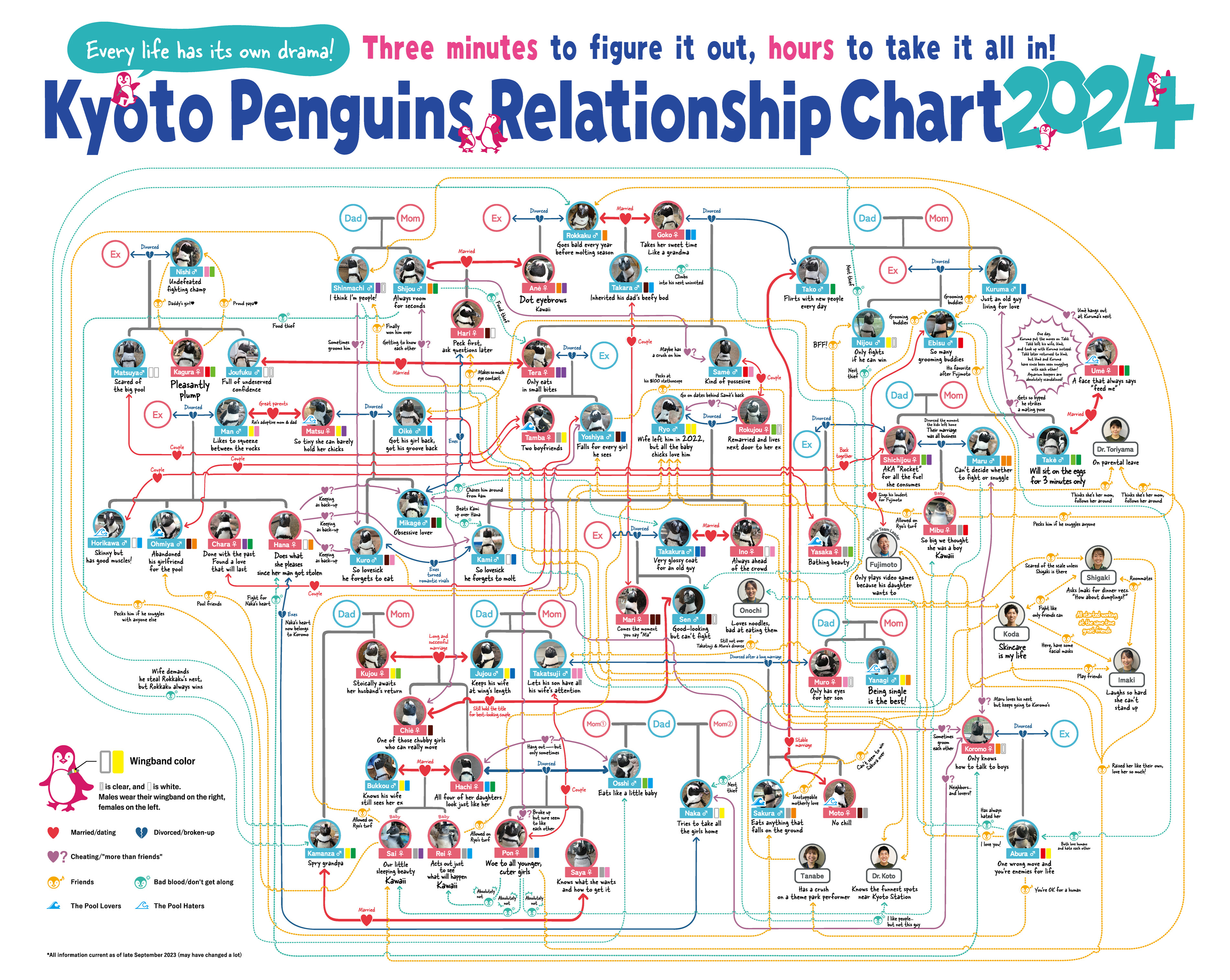
- Japanese penguins relationship charts 2024
Source:
- English: Kyoto Penguins Relationship Chart 2024|Kyoto Aquarium
- Japanese: Sumida Aquarium -「すみだペンギン相関図2024」公開中!|すみだ水族館
Another chart from Kyoto Aquarium
Source:
Seen on: Spoon & Tamago
> Penguins, the way they waddle around and protect their eggs, are often thought of as cute, cuddly and romantic. But those who observe them for extended periods know they have a dark side. Two aquariums in Japan, Kyoto Aquarium and Sumida Aquarium, keep obsessive tabs on their penguins and maintain an updated flowchart that visualizes all their penguin drama. > > Penguins are highly social species. They like being with others and, like humans, this can often lead to polyamorous and sometimes scandalous situations. Penguin drama can include serious crushes and heartbreaks but also adultery and egg-stealing. Penguins may even develop crushes on their caretakers. And these Japanese aquariums have it all charted in a flowchart that can be studied for hours.
EDIT: Thanks to @flora_explora@beehaw.org for pointing out the english versions.
- Terrestrial Vertebrate Biomass
source: https://www.greenpeace.org/international/story/17788/how-much-of-earths-biomass-is-affected-by-humans/
- Disability-free life expectancy in the EU 27
Disability-free life expectancy in the EU 27
@dataisbeautiful !health@lemmy.world !labplot@lemmy.kde.social
LabPlot ❤️ Data
\#DataViz #Statistics #Visualization #Health #Disability #LabPlot #OpenSource #FOSS #DraculaTheme
- Pearson correlations between beliefs in conspiracy theories and partisan and ideological self-identification. Horizontal bands represent 95% confidence intervals, two-tailed tests
"Are Republicans and Conservatives More Likely to Believe Conspiracy Theories?"
Enders, A., Farhart, C., Miller, J. et al. Are Republicans and Conservatives More Likely to Believe Conspiracy Theories?. Polit Behav (2022).
Abstract
>A sizable literature tracing back to Richard Hofstadter’s The Paranoid Style (1964) argues that Republicans and conservatives are more likely to believe conspiracy theories than Democrats and liberals. However, the evidence for this proposition is mixed. Since conspiracy theory beliefs are associated with dangerous orientations and behaviors, it is imperative that social scientists better understand the connection between conspiracy theories and political orientations. Employing 20 surveys of Americans from 2012 to 2021 (total n = 37,776), as well as surveys of 20 additional countries spanning six continents (total n = 26,416), we undertake an expansive investigation of the asymmetry thesis. First, we examine the relationship between beliefs in 52 conspiracy theories and both partisanship and ideology in the U.S.; this analysis is buttressed by an examination of beliefs in 11 conspiracy theories across 20 more countries. In our second test, we hold constant the content of the conspiracy theories investigated—manipulating only the partisanship of the theorized villains—to decipher whether those on the left or right are more likely to accuse political out-groups of conspiring. Finally, we inspect correlations between political orientations and the general predisposition to believe in conspiracy theories over the span of a decade. In no instance do we observe systematic evidence of a political asymmetry. Instead, the strength and direction of the relationship between political orientations and conspiricism is dependent on the characteristics of the specific conspiracy beliefs employed by researchers and the socio-political context in which those ideas are considered.
https://rdcu.be/dnPTM
- Most Popular Movie Genre Combinations (up to October 2023)old.reddit.com [OC] Most Popular Movie Genre Combinations (up to October 2023)
Posted in r/dataisbeautiful by u/shahinrostami • 58 points and 5 comments
![[OC] Most Popular Movie Genre Combinations (up to October 2023)](https://infosec.pub/pictrs/image/8c53158d-2dba-446e-88b8-85dec6038116.png?format=webp&thumbnail=256)