Electricity Maps
Electricity Maps

app.electricitymaps.com
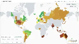
Live 24/7 CO₂ emissions of electricity consumption
Electricity Maps
Live 24/7 CO₂ emissions of electricity consumption
That UI is beautiful.
Just wanted to say the same.. such an unexpected surprise
It must load differently on mobile I guess
Australia, what you doin'!? So much coal, what the fuck. In a country where you'd expect they have so much space and sun, they could just go solar.
Welcome to our government and their pockets lined with coal money. Not the most ecological government going around. We got a new one recently so hopefully they do atleast a bit more than thr last ones.
Think they have still approved 3 more coal mines, so probably have their pockets lined as well.
A related tool for Germany: https://peakpick.de/webapp/index.php
The idea behind this:
This made me aware that the best time to use electricity is around noon (+/- a few hours). By shifting your electricity consumption to this time, you can cause less emissions, regardless of your contract.
Open question: A complete picture would require plotting the consumption along the production. For example, while renewables might peak at 1 PM, maybe all that capacity is already eaten up by consumption at that time. If hypothetically consumption was below capacity at 3 PM, it might be better to consume then, even if capacity is lower then.
No data available... Yeah I doubt that
You can help contribute by adding data.
Good point, I might try to do that.
Shouldn't there be some normalization based on population? Like some of the low population states / siberia have bad emissions but that should have much less effect than a smaller difference in a more populated location.
It's an electricity map, not am emissions map. Otherwise you would have to also factor in the industrialization of the country and its imports & exports.
You can still normalize based on your totals. Otherwise the coloring is not that useful.
Eg. Western Area Power covers a large part of the US but only produces 5GW.
PJM produces 100GW and covers around the same area including 20GW of coal, 7x that of Western Area.
There should be an option to normalize so you can quickly see where most of the emissions come from.
South Africa's data likely doesn't account for all the diesel burning to avoid worse Loadshedding stages.
Kind of surprised South Carolina is so bad. Just drove by so many solar farms you'd think the state ran it alone. Apparently my random sample was incredibly biased. Also they're fairly recent installations, so maybe it hasn't filtered into the data.
Be aware that the CO2e emissions shown in this app give an indication but have pretty big caveats:
Regarding nuclear to put it into numbers: Current estimates average at about 66g CO₂eq/kWh ranging up to 180. This site uses 5 as estimate!
Thank you for the hydro part, didn't know that yet. It does not seem as bad as you said tough, This paper states up to 73g CO₂eq/kWh which is far below the 400-800 of a stone coal plant.
My info came from Wikipedia. Your source is from Canada, not Brazil which is exactly the point. :)
Additionally to your points
the amount of electricity produced by solar pv is significantly underreported. Because a lot of pv is behin the meter and therefore not included.
True. Everything that happens outside of the grid is not counted. That means a lot of rooftop PV generation is not counted but it also means that big companies with private fossil gas plants are not counted either.