GNOME Devs are rethinking the "Activities" button
GNOME Devs are rethinking the "Activities" button

www.omglinux.com
GNOME Devs May Replace 'Activities' Label with this Indicator - OMG! Linux
GNOME Devs are rethinking the "Activities" button
GNOME Devs May Replace 'Activities' Label with this Indicator - OMG! Linux
Well, I'm trying it out and I gotta say... I just don't care.
I mean, it looks nice, and I guess the extra info is good. On the other hand, I weirdly miss the word in the corner. On the other, other hand, it's such a small change I can't imagine getting upset about it if it became the default.
So... Yeah. Whatever's clever, Gnome team. I'm happy either way.
On the other, other hand, it’s such a small change I can’t imagine getting upset about it if it became the default.
Haha, more folks should have this attitude.
I agree. I saw someone said something along the lines of "kill it with fire" an all I could thing was that sounds like a lot of effort for a couple dots in a corner.
I'm using it now and I feel the same way. It makes more sense to have a workspace indicator but I'm so used to the activities text at the top left that it just feels weird. I don't care if they change it it's just weird not having it after seeing it for 6 years
Configurability is the answer. Some people like it some don't, just have a setting to turn it off and it's fine
Personally I don't see much point in it as I just use the three finger swipe anyway, too much effort to mouse up to the top left and click it then navigate a GUI compared to just swiping left and right
Hmm, I wouldn't like having such a setting cluttering up my settings panel. Maybe they could allow the user to configure whether they want such a setting?
You'd need a setting to decide whether you wanted that configuration file too though, I'm not sure if I'd want it taking up space on my disk
It's not a terrible idea... I actually use the mentioned Space Bar and really like it (makes me miss i3 less :)).
Why'd you switch from i3? If it was for Wayland support, in case you didn't know, the Sway window manager is basically a drop-in replacement for i3, but for Wayland rather than X11. You can literally copy/paste your i3 config into ~/.config/sway/ and it will only need a few minor tweaks to get fully working!
I just made the switch this past week. The one caveat is Polybar doesn't work correctly with Sway, so I had to configure Waybar instead. Waybar has some cool features though, like being able to place the tray anywhere you want, so it was worth the effort to switch.
I don't use Wayland at all, though I am aware of Sway.
I switched to Pop and GNOME because... for lack of better phrasing, I wanted a more normal experience that I could recommend others. I used Void and i3 for about 6 years (Arch + i3 for years before that) and just wanted something I could recommend to new users and support them as well (hard to support something I don't use myself). Pop and GNOME with the tiling features is a happy medium for me. Far from perfect, but good enough.
I like it. Def more useful
As long as I can hit the top left for the activities or a similar/more useful screen, I am happy
Good! I don't get much use out of the button (or hot corner tbh) on a laptop. Gestures are king
Been using the PoC extension for a few days now and I'm absolutely in love with it <3
What das it do?
Read the article?
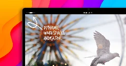
Basically, it replaces the word "Activities" with dots representing your workspaces, with the one you're on being a pill-shape. So if you had three active workspaces and you were looking at the third one it'd be kinda like this:
O O (__)
It doesn't affect the button itself at all, just changes the visual.
That seems l like a fine addition, although visually an explicit number being shown would be enough and even better imho.
Literally never use the activities button. Happy to see it go.
Still a piece of garbage. Can't they simply admit they were wrong and add a permanent panel with icons (like Windows or Mac) at the bottom of the screen and move on?
I can’t agree as I love Gnome and now feel lost when I have to use windows or MacOs. The way it uses the workspace and the way your screen isn’t cluttered with informations is great for someone like me.
And extensions are there to help you with almost every limitation you encounter.
You don't like your LEDs blinking Morse code of your 1s average combined CPU load?
Again, extensions aren't as polished as built in stuff. A prime example of this was when they ditched desktop icons, the extensions that followed fail sometimes.
Or just you can use a different de and move on?
I mean if oyu don't like it, then don't use it or install an extension. I never missed a bar at the bottom and can find all open windows in the overview very quickly
Use the dash to dock extension
I'm using that and ArcMenu...
They weren't wrong. There is no need for a panel, you can just type what program you want. It's not year 2000 anymore.
Besides, Plasma is much more like Windows. It has panels, lots of windows and bugs.
Dash to panel/dock + Arc Menu? ;)
I know it's contentious but for laptops and limited size displays I love the GNOME layout over KDE. Gestures are also way better, even on X11.
It does everything MacOS was trying to do, but executes it way better. I say this as someone who uses MacOS daily for work.
It has some pain points but there's a reason it's such a large part of the Linux ecosystem
@TCB13 @thegreenguy I prefer it the way it is. If you love the Windows design so much, just use KDE.
You will do it the way they saw in that fever dream, for such is the way of Gnome.
I wish that's all they were wrong about...
This is really cool. I install extensions to remove the Activities button and display a workspace indicator.
A lot of Workspaces might present a problem though. Currently, the Workspace indicator extension with collapse into a number after 8, or so, and I’m not sure how that scenario would work with the proposal.
Btw, they released it as an extension.
It seems more and more that the GNOME extension ecosystem is going to make it more customizable than Plasma one day
thank