Comparing two identically designed websites, their weight, amount of HTML and CSS, rendering speed, and best practices.
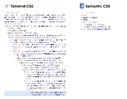
This study compares two websites with similar design: the commercial Spotlight template from developers of Tailwind vs the same site with semantic CSS.
I spent the last week learning and then writing technical docs on tailwind for my org. I was skeptical of it at first, now I have an informed dislike of it.
I often interact with people who don't like something but haven't used it before, so I'm definitely going to steal your term "informed dislike" to distinguish between those cases and ones that are legit gripes.
This person thinks Tailwind is just a grift to make money, prioritizes separations of concerns over all else (I contend they have SoC brain-worms, but I don’t want to get too spicy), and ignores all the actual arguments people use for Tailwind, like how it’s specifically built to suit component frameworks over someone raw-dogging that HTML and CSS. Their argument boils down to “get good” which is the argument that folks use when they’ve never been on a team and have never had to make actual trade-offs.
Their arguments included the size of the web page, and the time to display the first content, both of which were significantly better in Nue when compared to Tailwind.
By all means argue on what is important (because what is important for your projects may be significantly different from mine), but there were many points that the author was highlighting, not just the separation of concerns. And for my projects, all these concerns are important.
They’re valid concerns, for sure. I have less issue with this article in particular than I do with some of the other things he’s written. In the context of his other opinions, I feel pretty dismissive of whatever arguments he presents, valid or not. He’s extremely biased and I think folks have to take everything he says with a grain of salt.
There's absolutely a massive internal bias people have where they naturally believe that others develop the same kinds of content, when really it's half working on page based content, and half working on component based content.
Page developers know that putting their styles in the content itself is a disaster when you want to make a global change.
Component developers know that putting their styles external to their components is a dx nightmare because developers keep making changes that they think only affects one component when it actually impacts a different component (and that change might not be found until months or years later).
Both are correct.
The real problem is developers thinking that there are only two methods for making styles: external css files, and tailwind/atomic styles in class names.
Component developers should have their styles inside their components, but not inlined in style attributes (like in tailwind).
Component developers should instead place a style tag inside their component that is scoped to just that component.
So let's say you're making an accordion component.
Make your html+js/jsx like you already do, and add an "accordion" class to your component's root element. Now add a style tag in your component with a single selector targetting the .accordion class. Now you can use nesting to style anything in the accordion exactly how you want. Want to style something based on whether an element is open or not? Use an attribute selector. Want to style something based on whether it's child is doing something? Use the :has() selector. etc...
If you're making a widget system, use container queries. If you're making a card system, use subgrid.
There's so many obvious use cases that modern css provides for, so use modern css! and not any of this BEM or tailwind nonsense. Now your css is so much smaller, robust and more maintainable.
Follow up questions:
Q: But I don't know modern CSS
A: Learn, it'll be much better for you in the long run compared to using tailwind, then needing to learn something else once people switch off tailwind for something else.
Q: But wouldn't putting a style tag in every component mean that there's going to be two style tags on the page if I put two of the same component on the page?
A: It'll only do that if you make it do that. Most component based frameworks are already set up to reduce repetition, check your framework's docs. (e.g. react's many css-in-js solutions, web component's :host selector, vue's <style> and <style scoped> elements, SSGs like Eleventy have Asset Bucketing, and even native html is getting it's own solution this year with @scope).
Tailwind feels like CSS i have to re-learn. It's maybe slightly easier? mostly it just makes my html unreadable to the point i barely know what's going in anymore.
I don't do much frontend stuff but i'm gonna go back to plain old CSS for my next project.
It all sounds good in theory, but in practice, tailwind has been more work rather than less.
I feel like i put a fair amount of time in understanding how everything works too.
It just really feels like one of those things that makes little difference but i wasted way roo much time on trying to give it it's fair chance.
I've seen people advocate for Tailwind because "CSS is too hard, I don't want to think about selectors".
CSS isn't too hard, there are easy ways to do things, and hard ways to do things (for backwards compatibility reasons). If you don't learn modern CSS then you're only going to be doing things the hard way.
A lot of comments seem to think that Tailwind is just a way to save a few keystrokes at the expense of legibility and leanness.
For me, the value comes from not having to jump all over a codebase, not having to name so many things, having clearer scopes and pulling things like colors and spacings from a central config.
I know there's a hundred different ways to solve those issues that wouldn't offend CSS purists but ask 10 different people and you'll get 10 different answers with 10 different caveats.
So I use Tailwind to write fuckugly markup in a faster, easily iterated way that will be instantly familiar to anyone who knows Tailwind.
I loathe Tailwind. It offers absolutely nothing in advantage over plain CSS other than possibly development speed (but not re-development speed). I realise it's meant for frameworks rather than smaller sites but at some point you know someone is going to have to hands on edit that mess.
My spouse (senior fs) just started using Tailwind at work for a new project where he's having to rewrite a component library they have and daily he comes to me to say how much better working with Tailwind is.
I (also senior fs, mostly SSGs and Laravel applications) had a similar revelation coming from componentized, precompiled BEM SCSS - I thought Tailwind was weird, verbose, dumb, and bad until I actually used it.
I got to the point pre-tailwind that I was abstracting most of my design elements out, anyway. (Fuck the custom form elements my clients demand.)
Tailwind just starts you at the point of "I abstracted everything" and trusts you to be DRY.
Having used it in a major project its a shame that its so inefficient because the user experience really is much much better. It feels like a successor language to CSS because it fixed lots of unobvious and badly named attributes and makes lots of things just easier.
The code is more verbose but also you can completely understand how the page will look just by reading the html.
That said it makes sense the performance is so much worse, where you would have matched on one class for N styles you now match on N classes for N styles.
Theoretically its totally possible to do that matching at compile time and 'compile' the string of classes you wrote into individual ones per element for each combination used in the html though.
Tailwind is only feels like a successor to CSS to developers writing css like it was 10 years ago (or using frameworks that write it like that, e.g. bootstrap), or projects not using visual regression testing.
Modern css is so much better.
Want to position, overlap, or align things? Use CSS Grid.
Are you using a CMS or component system and want to change the order that CSS is applied? Use Cascade Layers.
Want to have resizeable components? Use component queries.
Want to make a change all through your site? Use custom properties.
Want to style things differently based on how many other elements are inside or around it? Use :has(), +, ~, nth-..., ... selectors.
If you're using something like BEM, or bootstrap to make columns, your knowledge is way out of date and you're doing it wrong.
The article doesn't include the information that it uses Nuemark, "a standalone library that works under Bun, Node, and Deno", written by the author himself. It "comes with a set of built-in components aimed at addressing the most common content management use cases" and is part of Nue, which the author markets as "A perfect framework".
There is one mention of Nue, in the original comparison, and another at the end under "What is nue?" - Maybe it's "expected" that the reader knows the author is using Nue and shouldn't need to make it clear, as the blog is hosted on nuejs.org, after all. Not the best practice to omit that, tho.
But what really annoys me is people making "minimalist" sites using FUCKING JAVASCRIPT FRAMEWORKS. Use a fucking markdown -> html converter