14
comments
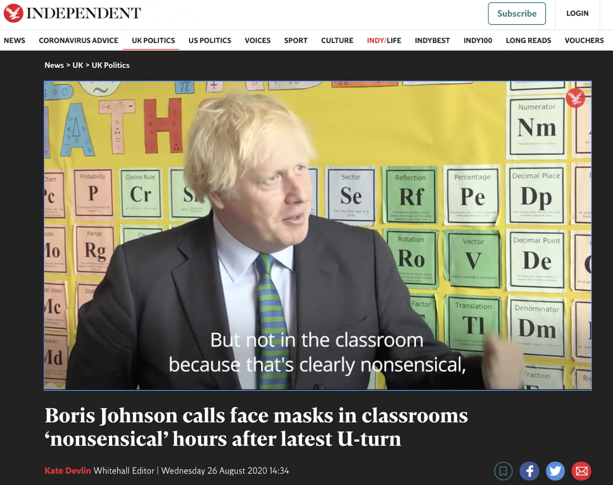
This can’t be real. Is it?
You're right, it isn't the real periodic table, it was probably either photoshopped or made beforehand to troll him
I hope it is, but the 'R' looks slightly out-of-place to me. It being simply off-center could just be due to the way it was made, but it also looks slightly rotated relative to the text below it, which seems unlikely. But maybe my eyes are playing tricks or there's some other explanation.
The teacher who put it up knew, the camera guy knew, everybody knew.
Except you, you didn't know this image is shopped.
If it is, I did not
You've viewed 14 comments.