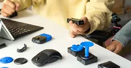
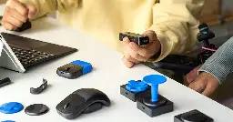
It's a clusterfuck. I don't need any accessibility hardware or software. I'm "abled". But I use it anyways, because it makes the human computer interaction far easier.
Most of the hardware out there is utter shit. I have a big 3 pedal foot switch I use with my MacBook. Out of the box it's helpfully set with each pedal being a b and c, with no built in way to change any of that. I've got a karabiner configuration that makes them more useful.
I tried using eye tracking hardware to center my cursor on the display I was looking at, before I got rid of it in frustration.
The only pieces of hardware that work how I want to are the ones I built myself (keyboard and numpad). Everything else requires a bodge. And that's shit. I'm abled and technically minded. If a system doesn't work for me, I can just go back to the happy path. A person with limited mobility cannot. And the disability advisors and advocates and volunteers who set these things up for people usually don't know any better, so they just cargo cult solutions and employ them rote. They don't mean anything negative by it, they're trying to help people. But they aren't typically super knowledgeable about tech either. They get led around by the nose by clever bits of marketing and poorly understood instructions.
Software explicitly marketed as "accessibility" is generally awful. At previous jobs I helped oversee the implementation of accessible systems for a website, in cooperation with a local accessibility advocacy group. For screen readers they used either JAWS or the Apple built in one, voiceover. Both of which work, but not great, with chrome or firefox. Eventually we found ChromeVox, made by Google, and showed it to this accessibility group. Iirc they now use it when helping to set up people with software, because it's just so much better than anything they used before.
Similar stories exist with regards to the SurfingKeys browser extension. In short, it gives you a keystroke that puts vim style easyjump targets on every clickable element on the page, so you can trigger anything with a few keystrokes. Target selection can be simplified down to a very small selection of keys, say the left hand home row.
For people with highly limited mobility, most page navigation solutions out there are atrocious. At best you get an x-y scan, where you trigger the scan, get a slowly moving cursor in one axis, stop it when it intersects what you want to interact with, and then repeat with another cursor along the opposing axis. If you don't use this, you get to tab through everything, one item at a time. Some systems allow for cursor key navigation (arrow keys), but that's hit and miss.
I showed the accessibility consultant SurfingKeys, and they were floored. They had a few people they were helping out who had full operation of a hand or whatever, but not enough to really use a mouse. SurfingKeys and a simple USB numpad with some key rebinding let these people use the Internet far faster than ever before. They could click links! They could scroll. Finding and clicking something on a search engine was no longer an exercise in patience and frustration.
I wanted to quote a section of your comment, but my hands are currently jittering too badly to select it, because my phone doesn't recognise it as a long press if the finger keeps jittering about. Careful typing and autocorrect options are incredibly helpful here, but I never even thought about looking into accessibility options for this (it's a very rare issue, so jot usually a nuisance).
Anyway, I wanted to reply to the job about software accessibility: I had a job once where - among other responsibilities - I checked the web-app we were producing for accessibility, in order to assemble a list of issues. It would have been shorter to just write "the whole damn thing" because abso-fucking-lutely nothing catered to the standards that we were given to adhere to.
You can fix colors, you can fix focus highlighting, but you can't easily fix the whole damn thing being neither arranged in a reasonable navigation order that traversing it by keyboard would make sense nor usable by screen reader at all because absolutely nothing made sense in terms of structure, tables etc.
Yeah. A lot of companies try to just bolt a11y onto an existing app. You have to design from the start that way. And if you do, it actually makes a better app for everyone
I'm glad they mentioned cost. Being a person with disability costs in really ridiculous ways. I learnt that a simple Bluetooth two-button device to use with phones costs U$400. WTF?