Electricity Live Map
Electricity Live Map

app.electricitymaps.com
Live 24/7 CO₂ emissions of electricity consumption
Nice tool to get an idea of different electricity markets.
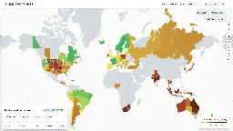
Electricity Live Map
Live 24/7 CO₂ emissions of electricity consumption
Nice tool to get an idea of different electricity markets.
I'm curious where they get their data. Their info for my area doesn't match the fuel mix report from my public utility.
Edit: looks like data sources are linked on their GitHub.
Same here. https://www.nem-watch.info/widgets/reneweconomy/ for Australia conflicts significantly in terms of fuel mix with the electricitymaps data.
EDIT: Possibly it's not exactly "live" and has a lag time of a few hours, at least going by the time written in the bottom left. Then the data is likely closer to correct.
It's a few hours behind and they have obviously problems with behind the meter production. Adfitionally, the values for CO2 emisdions are off (i.e. nuclear is calculated with 5g/kWh, this is 1/3 to 1/10 of the values you find in literature) But all in all, you can see the trends of production and im- export.