So someone put vertical text in a post title...
So someone put vertical text in a post title...
https://piefed.social/post/1004382
Same post viewed in Lemmy, it's all squashed into the same space as horizontal text.
So someone put vertical text in a post title...
https://piefed.social/post/1004382
Same post viewed in Lemmy, it's all squashed into the same space as horizontal text.
H̶̢̬̭̱̲͖̬̻̩̘̫͉̔͛̕e̵̢̖̜͓̘̫̹̙̫̻̱̣͓̐̅̍̏̍̅̅̑́̉͆̈͘͘͝ͅͅl̴̝͆͛̾̒͌͛̏̊̃̚̚͝͠͝l̵̨̡͙̗̩̱̘̼̖̪̃͋̀̆̀͑ơ̷̺͎̱͒̿̏̈̑́̑͠͝,̵̢̡͉̯͎͐͆̆ ̴̞̲̦̝͓͕̟̹̖̳̫͚̤̙̰̔̍͌̽̿̏̐́̽̒ͅͅI̷̢̡̻͇͙̲̺̾̊̆̂̈́͌̈́̄̉͑ ̵̢̛͓̥̱̲͎͈̣̳̮͖̝͗̌ͅa̶̫̗̗̠͖̰̠͚̳͔̻̺͎͓͍̘̤̎̒͌͗̏̄̌͂̒͝m̸̨̛̗̜̙̰̫͐̈̊͗͌̀̂̽́͜͝ ̴̳̰̻̋͆̀̽́̔̀͊̒͋͘̚s̴̻͋̍́̇̌͂̽̋͂̈͘̕̕c̶̡̢̧̡̘̺̝̬̱͖͔̥̝͍̑̏̃͌̃͊̌̄̓̀̍̚͜à̷̛̫̀̿̈́̒̒͆̏͆͗͌́̍͜r̴̤̐̀̉͂͂́̍̉͝ỵ̶͉̮͈̤̩͇̖̟̖͂̈̈͒̏͐̂̿̈́̂̅̕͠͝͝͝.̷̝̬͔̙̭͙͓̩̖̣̺̝̀͊̿̐̒̈͋̽̒̃̇̐̊̒̕̚͜͠ ̴͓̱̂̌͂B̵̭̱̠͙͋̒̌̆̓͆́͒̿o̷̡̬̬̪̗̫͉̬͇̰͎̺̻͛͝ọ̵̪͎̙̣͗̆̉̽̑͆̎̊̾͘̚͘͘!̴̰͆̐
:D
It's called Zalgo. Disappointingly, the Voyager UI protects me from it overflowing and smushes it together. :)
I imagine it is torture for people who use screen readers, so I apologise.
AHH!
I see the vertical text overlaps UI elements in the Notifications window too. And in comments.
I have deployed a fix. Thanks for bringing this up.
Thanks for handling it. :)
How will you deal with actual vertical text?
People trying to be 'cool & edgy' but it really just marks them as annoying idiots. Thanks for the self inflicted Scarlet Letter.
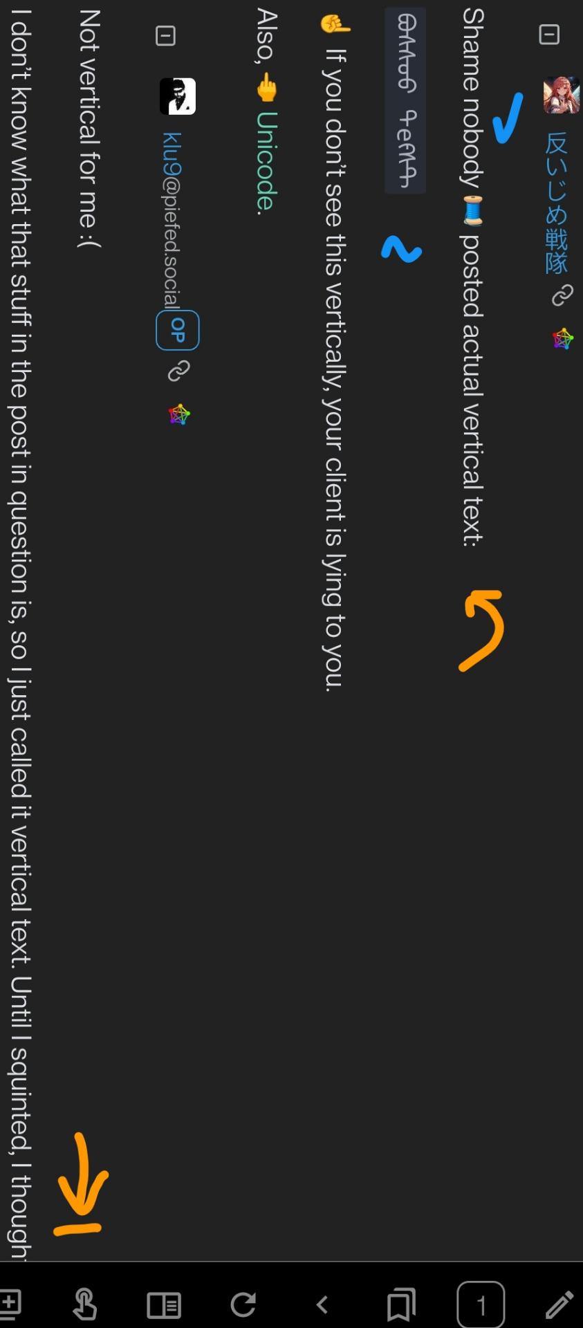
Shame nobody 🧵 posted actual vertical text:
ᠪᠣᠰᠰᠣᠣ ᠲеᠻᠰᠲ
☝️ If you don't see this vertically, your client is lying to you.
Also, 🖕 Unicode.
@AntiBullyRanger @klu9 I would like to see the verticle text in action, where can I load this to see it?
I'm honestly at a loss for recommendations. I tried Iceraven, and it didn't have reading or vertical text mode. Einkbro’s orientation is jarring for LtR language mixed with verticals:

In portrait mode, it should paragraph leftward. Ideally a 25 character wrap to indent the next line in the paragraph. I’ll try make an html+css example later.
I love all the things unicode support by default but one should not be ashamed to refuse to support some features.
Not vertical for me :(
I don't know what that stuff in the post in question is, so I just called it vertical text. Until I squinted, I thought it might have been Manchu script :D
Not vertical for me :(
Switch 𐑑 client 𐑞𐑑 1) displays vertical text 2) 𐑯 has recursive font support. 𐑓 Mongolian Bichig, Gecko is recommended. (Not by me). Mongolian White is rec. as well.
Here’s how our exchange should have looked like:

Like others already mentioned 🧵, «Zalgo» is randomized unicode diacritics abuse. If 𐑘𐑹 client escaped 𐑞 diacritics, 𐑘𐑹 font is displaying diacritics correctly.
𐑖𐑱𐑝𐑾𐑯 subs used
For what other purpose does vertical text exist I ask you.
"Forget your perfect offering. There is a crack, in everything. That's how the light gets in."
The typical example given is Japanese text traditionally being written vertically, but I am doubtful that it has any uses in a forum. That's a bit like claiming that you need cursive fonts because it is traditional in western countries.
Cool way to make zalgo text, kinda.
This reminded me: One day I tried to read some Japanese novel in EPUB format. The text inside is, like many Japanese novel, vertical right-to-left.
None of the epub reader except Google Play Books displays it correctly, vertical right-to-left