You're viewing a single thread.
Looks like an nfl team logo. I hate how contemporary corporate design it is.
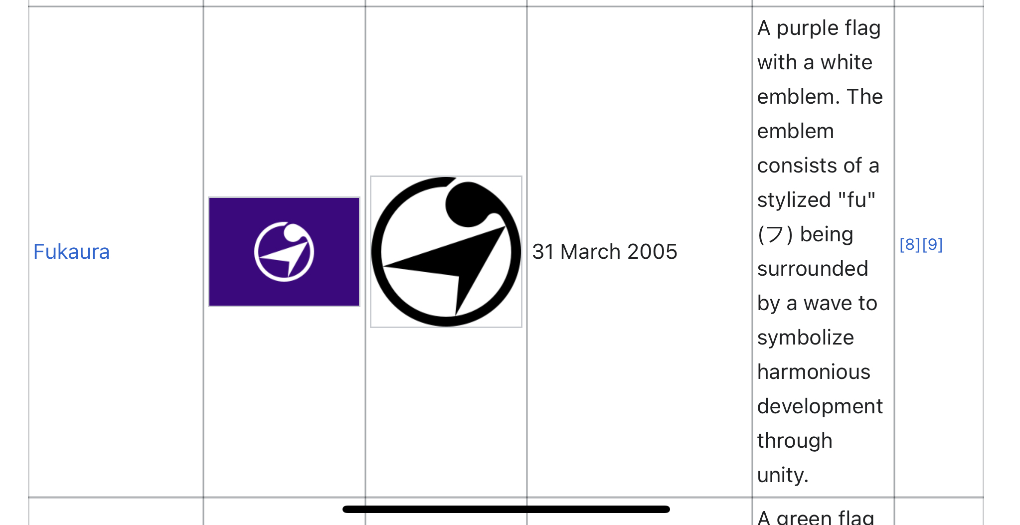
You think that's bad, check out some of the municipal flags in Japan, especially the ones designed in the early 2000s. The ones based on old clan symbols are fine, but those other ones look like some corpo bro from the 90s commissioned designs by saying "I want it to have more radical swoosh vibes!"
https://en.wikipedia.org/wiki/List_of_municipal_flags_of_Tōhoku_region
Hirosaki not changing theirs is… interesting.
I guess Buddhism is still common enough in Asia that WWII didn't completely ruin the manji. You still see temples marked on maps with it these days.
Some of those must have been straight up inspirations for Star Wars. Looking at you Hachinoche and Kamikita.
Those ones are probably based on historic clan emblems
Still better than the state seal on a flag
I see Star Wars, the Klingons, a mirrored Swastika, Harry Potter, and a few others in there.
This one makes me think of an airline.
That's funny because that place is pretty deep in the boonies, about a 2 hr drive from the nearest airport.
Weird, it doesn’t feel corporate at all to me. A flat, simple design doesn’t immediately mean something’s corporate.
I don't have any art background so I can't really describe why the (non-clan based ones) feel so overly artificial. I think the color choice has a lot to do with it though-- way too many lime greens and oranges for me. Plus some of them are based on letters from the latin alphabet, which almost seems like a reverse weeb thing, ie "western letters are so cool guys!" Not that most of the kana ones are much better-- it's hard to make lettering on a flag look good.
Maybe the vexillology community would be able to describe it better.
edit: I mistook the comment I replied to as a reply to my comment below, but I'll leave this up as an explanation into why I find the Japanese flags strange
I can see where you’re coming from (in regards to Japanese prefecture flags) but I still think a lot of them look really good. At least the nicest thing is that they’re all consistent, but still a bit distinct from each other. And a symbol on a blanket is waaaay better than the american seal on a blanket in my opinion :)
Contemporary corporate is extremely fitting to the Mormon majority.