This week there’s a lot of news on the accessibility front in particular! Beyond that, we have a fairly juicy assortment of other new features and user interface improvements, so have a look:…
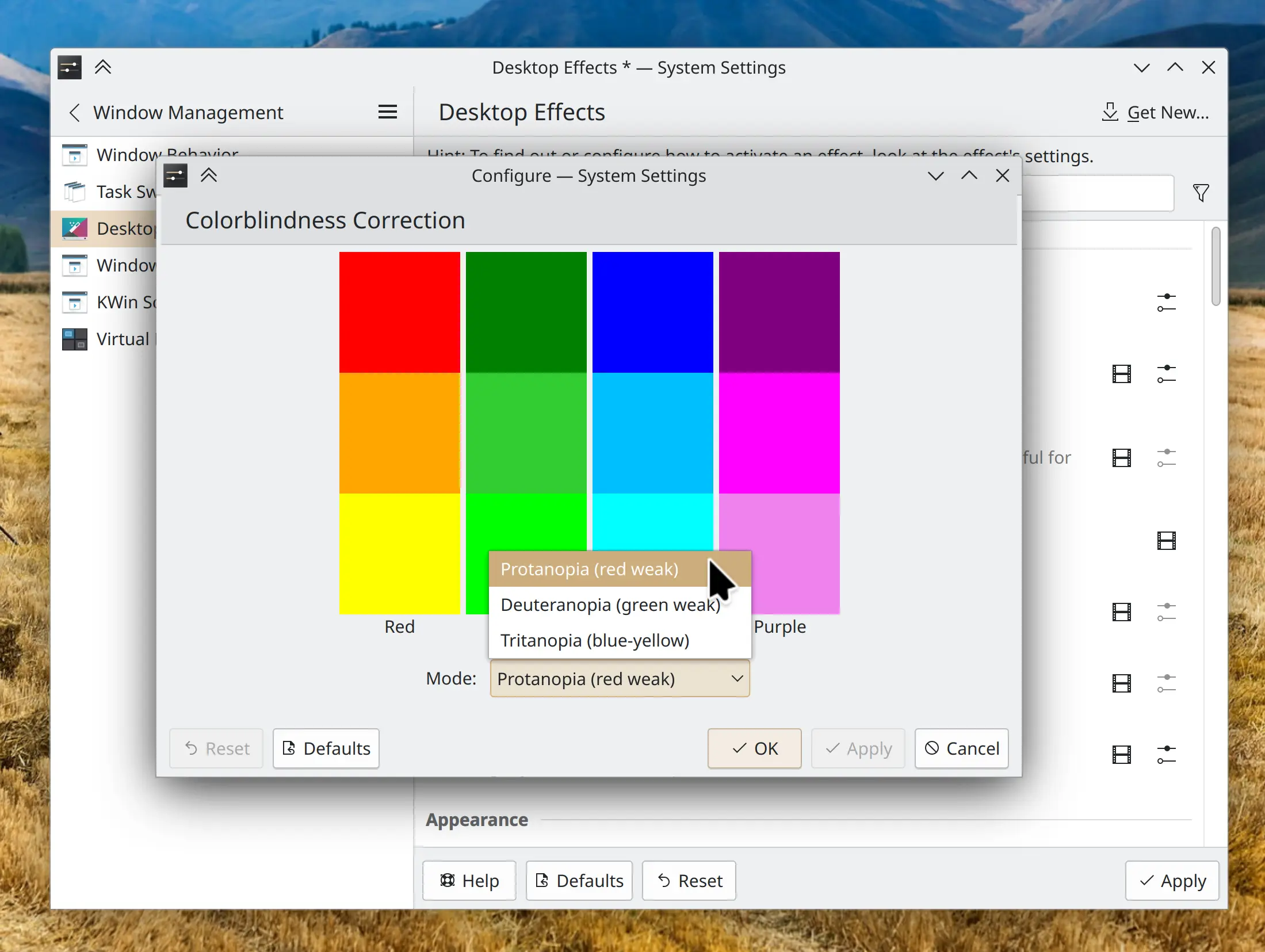
Good to know. I will say as a colorblind person, it's always a tad ironic because as a colorblind person, the filters don't make things definitive. It's still a bunch of random colors that I can't identify lol
Great question. Had to think about it and I'd say for me personally, poor implementation of color pickers is the biggest frustration.
As a technical user, I have no qualms w/ editing the default selection if it's hard to read due to colors, but I get frustrated with poor color picker implementation. For example, color swaths that don't have named descriptions when you hover over them. Even/especially the standard ROYGBIV colors on the first page of a color picker, but also to a lesser degree, descriptive hex codes on more nuanced online color pickers. I can't tell the difference and don't feel like hearing someone ask why I made the bold choice of making the sky pink.